
A surf-inspired living room does not need a board propped in every corner or a wall full of beach signs. The rooms that hold up over time usually take something quieter from the coast: a colour that recalls a wetsuit drying in the sun, the spare line of a board, the worn texture of wood and cotton.
The aim is not to reproduce a surf shack. It is to make a room feel as if the sea belongs somewhere in its memory. Start with the pieces you already live with, then bring in one or two references that feel specific to you.
Start with the feeling, not the surfboard
Good surf decor begins with a mood. It may be the early light on an empty beach, the stillness after a session or the bright, slightly graphic energy of a town such as Ericeira. Once you know that feeling, the choices become easier.
A calm room can carry a sandy base, pale walls and one deep blue or green. A more playful room can take a stronger print and let it lead. The important part is restraint: choose one main visual gesture, then leave it space to breathe.
Choose a palette with a little tension
Coastal does not have to mean blue and white. Pink next to sea green, rust beside a washed-out yellow or a warm cream against dark ink can feel closer to a real Portuguese coast than a catalogue version of the beach.
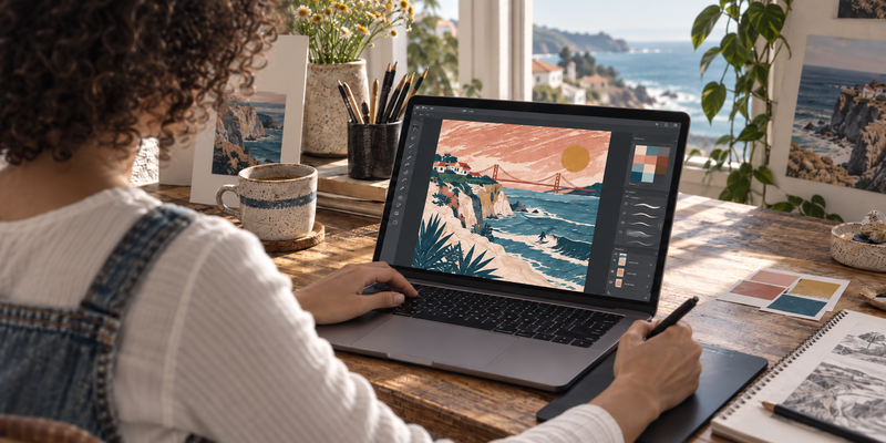
The Ericeira Longboard Poster works from that contrast. Its pale pink field and teal linework are graphic enough to sit beside simple furniture, yet the board and the list of breaks keep it firmly rooted in surf culture. Pull one colour from a print into a cushion, a lamp shade or a small vase. Stop there. Repeating every colour around the room makes the artwork disappear.
Give artwork room before adding objects
One framed print above a sofa, desk or low sideboard can do more than a shelf crowded with souvenirs. Hang it where the eye naturally lands when you enter. If the wall is large, choose an A1 or A2 format and keep the neighbouring objects low. If the room is compact, a smaller print gains presence when it is part of a pair or a loose gallery arrangement.
Frames change the tone. Black gives a poster a sharper edge; oak brings warmth; white lets a colour-heavy image feel lighter. There is no universal rule. Put the frame against the colours already in the room, rather than treating it as an afterthought.
Let materials do some of the work
Surf culture is tactile. A faded cotton throw, a woven rug, unvarnished wood and a ceramic mug can carry the same ease as a more literal reference. These materials age well, which matters more than making a room look finished on the first day.
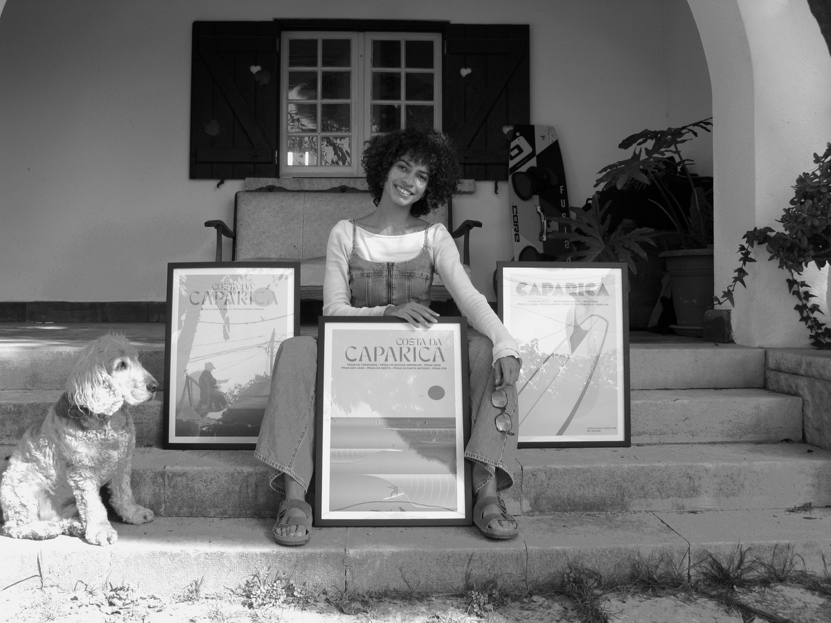
The Caparica Beach Life Poster suits rooms with warmer timber, straw and sun-faded tones. For something more architectural, the Lisbon Bridge and Cristo Rei Poster brings structure without losing the coastal connection. Let the art choose the direction; do not force every piece in the room to say “surf”.
Keep the references specific
A room becomes more convincing when its details point to a real place or habit. A photograph from a favourite beach, a board used for years, a print of a break you know by name: these carry more weight than a generic palm motif. They also give visitors something to ask about.
That is the useful test before buying anything new. If the object could sit in any beach house, wait. If it reminds you of a coast, a trip or a person you surf with, it will probably still belong in the room a few years from now.
Quick answers
What colours work in a surf-inspired living room?
Start with the colours already present in the room, then add one coastal accent. Sea green, faded pink, rust, cream and deep blue all work when they are used with restraint.
Do surf posters need to match?
No. A shared palette, frame finish or feeling is enough. Different places and formats often make a wall more personal than a perfectly matched set.
Where should I hang a large surf print?
Above a sofa, desk or sideboard is usually the easiest place to give a print enough breathing room. Keep the centre of the artwork close to eye level.
 Ericeira Longboard Poster
 Caparica Beach Life Poster
 Lisbon Bridge and Cristo Rei Poster